Polar plots with Pandas and Matplotlib
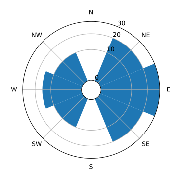
How to turn this:

into this:
This is the PNG version.
Try SVG instead of PNG.
value=
sector=
θ=
Introduction
Suppose that we have some data that is related to either direction or to some period cycle. It might make sense to plot that on a polar plot. An example of this is a Wind rose plot, used to show the strength of the winds from each direction.
Simple example
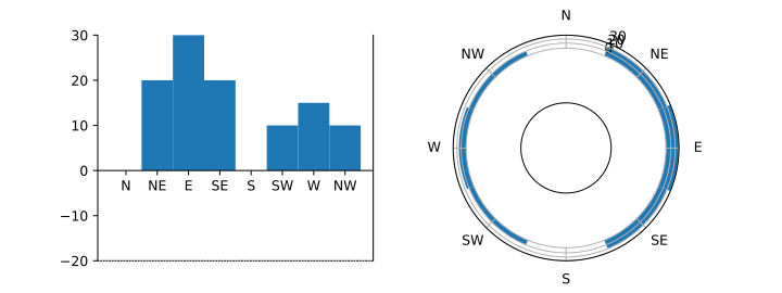
Let's start with a simple example - a simple bar graph that we then project onto a polar plot.
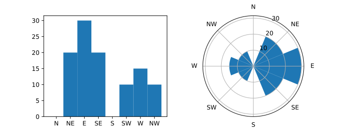
Matplotlib makes this simple enough, but it's fairly obvious that the projection gives undue prominence to the easterly values. The length of the bars is correct, but people perceive areas as more important then length.
Offset Origin
There are a couple of things we can do to fix this. The distortion is
greatest close to the centre, so one way is simply to push the bars out using an offset. Here, we add ax1.set_ylim(-20, 40) and ax2.set_rlim(-20,40).

The effect isn't satisfactory. The grid lines extending to the centre doesn't provide a strong sense of where the zero-line is.
There is another way to shift the origin, using ax2.set_rorigin(-20).
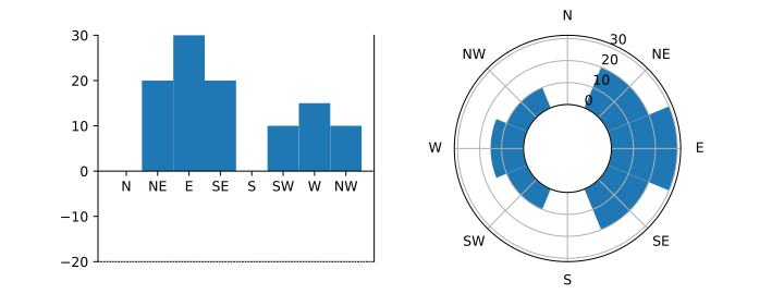
(Note: there isn't a set_yorigin() - I've just shifted where the x-axis is drawn for illustrative purposes.)
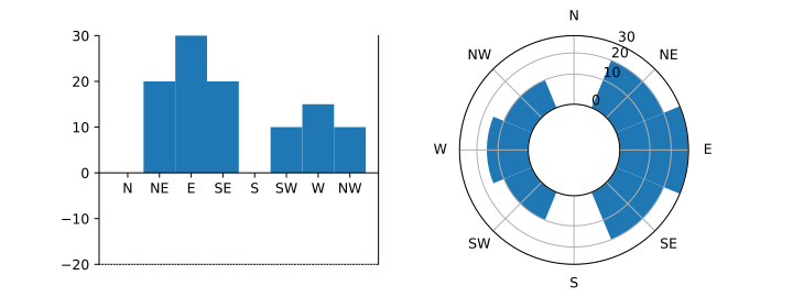
Area-preserving Transform
The second way is to change the y-scaling so that the projection preserves the ratios of areas instead of the ratio of lengths.
We use the mapping functions built into Matplotlib rather than just applying the transform to the raw data so that the theta grid lines (the circular grid lines, equivalent to the horitonal grid lines on the left), are in the correct positions and correctly labelled.

When specifying the mapping, it's easier to the numpy function rather than math.sqrt because Matplotlib needs to transform arrays of values; it doesn't call the mapping function one value at a time.
The result is good, but if there were any low values, it would be hard to be sure what the magnitude of those values is, so it would be better to apply both transforms.
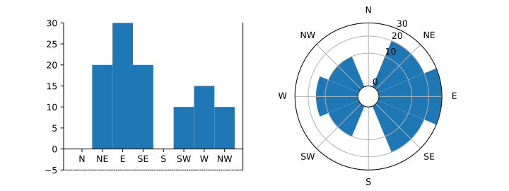
Both transforms
The transform is a little more complicated - the scaling function is fed r values where r is distance from the inner edge, but we want to transform values according to distance from the centre, so we translate r, do the transform, and translate it back again. The last step is so we can set f(0) = 0.
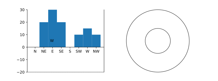
Oops! Where did the plot go?
And what's that 'W' doing over there?
It isn't a second W from the bar graph; it's escaped from the polar plot! If you run it interactively, you'll see that hovering the mouse over the plot shows r values increasing as the mouse moves towards the centre, which should be impossible given the transform.
In the code, notice how both the forward and reverse transforms always increase - they can't make the r values go backwards.
One of the problems is how the polar plot is implemented. As well as putting the data through the transform it also creates a bounding box around the 2-D plot and transforms the box coordinates in the same way. The transform we supply does not deal with the bounding box specially, however, the transform is defined at r=-20.
The result of our transform is not what Matplotlib expects; it
needs the result to be -20. Since we have no negative values, we
can fix the transform using np.where. Outside the
inner axis, we'll use the same transform as before; inside,
we'll use a linear tranform.
That's closer, but it's still not right. You can see that the sqrt transform is having an effect, but the data has been scaled so it all appears close to the outer edge.
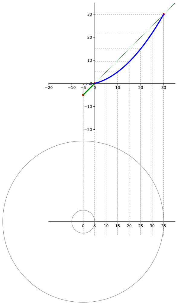
Working version
To get the scaling right, transform needs to map f(roffset)=roffset, f(0)=0, and f(rmax) = rmax
It's clear that the sqrt transform is still doing something, but it's hard to be sure that it is scaling correctly. For the purpose of demonstration, we can use a smaller r offset; the distortion near the centre will make is clearer that both transform is working. The following code uses r offset -5, but you should put this back to a larger value for real plots.
 r2 = max_value - r_offset
alpha = r2 - r_offset
v_offset = r_offset**2 / alpha
forward = lambda value: ((value + v_offset) * alpha)**0.5 + r_offset
reverse = lambda radius: (radius - r_offset) ** 2 / alpha - v_offset
ax2.set_yscale('function', functions=(
lambda value: np.where(value >= 0, forward(value), value),
lambda radius: np.where(radius > 0, reverse(radius), radius)))
ax2.set_xticklabels(data.compass)
ax2.set_rgrids([0, 10, 20, 30])
ax2.bar(x=data.index, height=data['value'], width=pi/4)
plt.show()
r2 = max_value - r_offset
alpha = r2 - r_offset
v_offset = r_offset**2 / alpha
forward = lambda value: ((value + v_offset) * alpha)**0.5 + r_offset
reverse = lambda radius: (radius - r_offset) ** 2 / alpha - v_offset
ax2.set_yscale('function', functions=(
lambda value: np.where(value >= 0, forward(value), value),
lambda radius: np.where(radius > 0, reverse(radius), radius)))
ax2.set_xticklabels(data.compass)
ax2.set_rgrids([0, 10, 20, 30])
ax2.bar(x=data.index, height=data['value'], width=pi/4)
plt.show()
This is the y-scale forward transform that worked.
This one is for the final plot above, which has r offset by -5 and rlim 30. Note the fixed points at [-5,-5], [0, 0], and [30, 30].
Shifting any of these breaks the plot, which means the transform depends on the inner and outer limits. This is why set_rlim() was used above, disabling autoscaling.
Peter Benie <peterb@chiark.greenend.org.uk>
Home