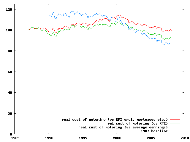
In fact, in real terms, motoring has become cheaper.
Since its peak in July 2000 motoring is 14.5% cheaper (compared to RPI) or 13.5% cheaper (compared to RPI excluding mortgage interest). Compared to average earnings motoring is 22.4% cheaper. Over the two or so decades since 1987 motoring costs have fallen by 7.7% (RPI) or 0.3% (RPI excluding mortgages).
The ONS figures take account of all of the costs of owning and running a motor vehicle, including purchasing, maintenance, petrol and oil, and tax and insurance. See http://www.statistics.gov.uk/pdfdir/cpi0408.pdf, particularly PDF page 20.
See also this BBC news article which has a few inflation-adjusted petrol price charts and some figures (which may have been just plucked out of the air of course).
I imported the resulting CSV into OpenOffice, and divided CHBK by CBZW and CHAW. I saved the result and also exported it as CSV. I processed the CSV with a Perl script to remove the annual and quarterly data and the footnotes, and reformat it for gnuplot. I then processed the result with gnuplot to produce the graph you see above.
I separately fetched the earnings data. Starting from http://www.statistics.gov.uk/StatBase/Product.asp?vlnk=550:
I cut-and-pasted the cells into my original spreadsheet. I had to renormalise the data. I chose the July 2000 peak as the renormalisation point; I took the arithmetic mean of the two real-terms motoring costs already calculated and obtained a normalisation factor of 0.6. This makes the figure for my related-to-earnings value roughly level with the other two figures on that date.
The files I created are available for download.
Ian Jackson 30.4.2008; last updated 2.5.2008.